Crafting Customisable Solutions: Rentman's New Pricing Structure
Project: New pricing structure on the website
Role: UX/UI Designer
Year: 2021
Role: UX/UI Designer
Year: 2021
Rentman, a software solution for event rental and production companies, sought to expand its market reach by introducing a flexible, modular pricing structure. This case study details the UX/UI design process involved in creating a user-friendly and informative pricing experience that aligned with Rentman's new commercial strategy.
Understanding the Challenge
Rentman, while successful, recognised the need to adapt to a broader market segment beyond traditional event rental. This involved transitioning from a rigid, all-in-one solution to a modular, customisable offering. Simultaneously, the marketing team aimed to effectively communicate this new flexibility to potential customers, ensuring they understood the value of paying only for the features they needed.
Defining the Goals
The primary goals of this project were to:
— Design a clear and intuitive pricing structure that reflected Rentman's new modular approach.
— Develop a user-friendly interface that allows prospects to easily understand and customise their plans.
— Create a pricing experience that effectively communicates the value proposition to diverse buyer personas, including the newly defined 'Crew' persona.
— Increase revenue by selling the new licenses.
— Increase the amount of current customers that upgrade their licenses.
The Design Process
The design process was conducted using Agile methodology, with sprints aligned to company OKRs. We began with a collaborative Design Sprint using Figma Jam, involving product and marketing team members, to define priorities and align on a shared vision.
— Buyer Persona Development: We conducted qualitative and quantitative research, including competitor analysis, internal interviews, and customer interviews, to develop detailed buyer personas, particularly for the 'Crew' segment. This research informed the value proposition and messaging for the new pricing structure.
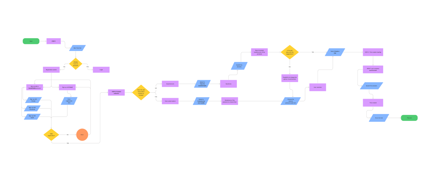
— Wireframing and Prototyping: Based on the buyer personas and use cases, we brainstormed potential pricing architectures and developed low-fidelity wireframes. Iterative design sessions led to the creation of a functional prototype, incorporating feedback from stakeholders and the sales team.
— Usability Testing: We conducted usability testing with 54 current customers to gather insights on the new pricing structure and identify potential usability issues.
BUYER PERSONAS FOR A NEW SEGMENT
To create a new pricing structure, we needed the Buyer personas of each segment. The marketing manager worked in the three primary buyer personas for the All-in-one solution for a previous project. For this specific one, a colleague and I worked together on the Crew buyer persona. This project aimed to understand the new segment. We had to create the value proposition and propose an accurate message to promote awareness on the marketing-sales funnel.
We did qualitative and quantitative research using different methods: Expert review of the Crew page, heatmaps and visitor recording, competitor analysis, and interviews.
1. First, we did a competitor analysis of this specific niche.
2. Secondly, we conducted internal interviews: One interview was with a sales member to understand how the prospects are usually interested in the Crew Planner and what they are looking for when they land on the website. The other interview was with a Product Manager to learn more about the identity of the Crew Planner and how it fits in the customer journey.
3. We created our hypothesis of the buyer persona.
4. We conducted three interviews with customers who use the Crew Planner module to see which insights could be validated to develop the Value proposition.
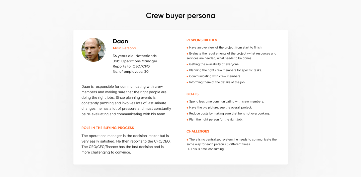
The entire buyer persona can’t be revealed for a non-disclosure agreement.
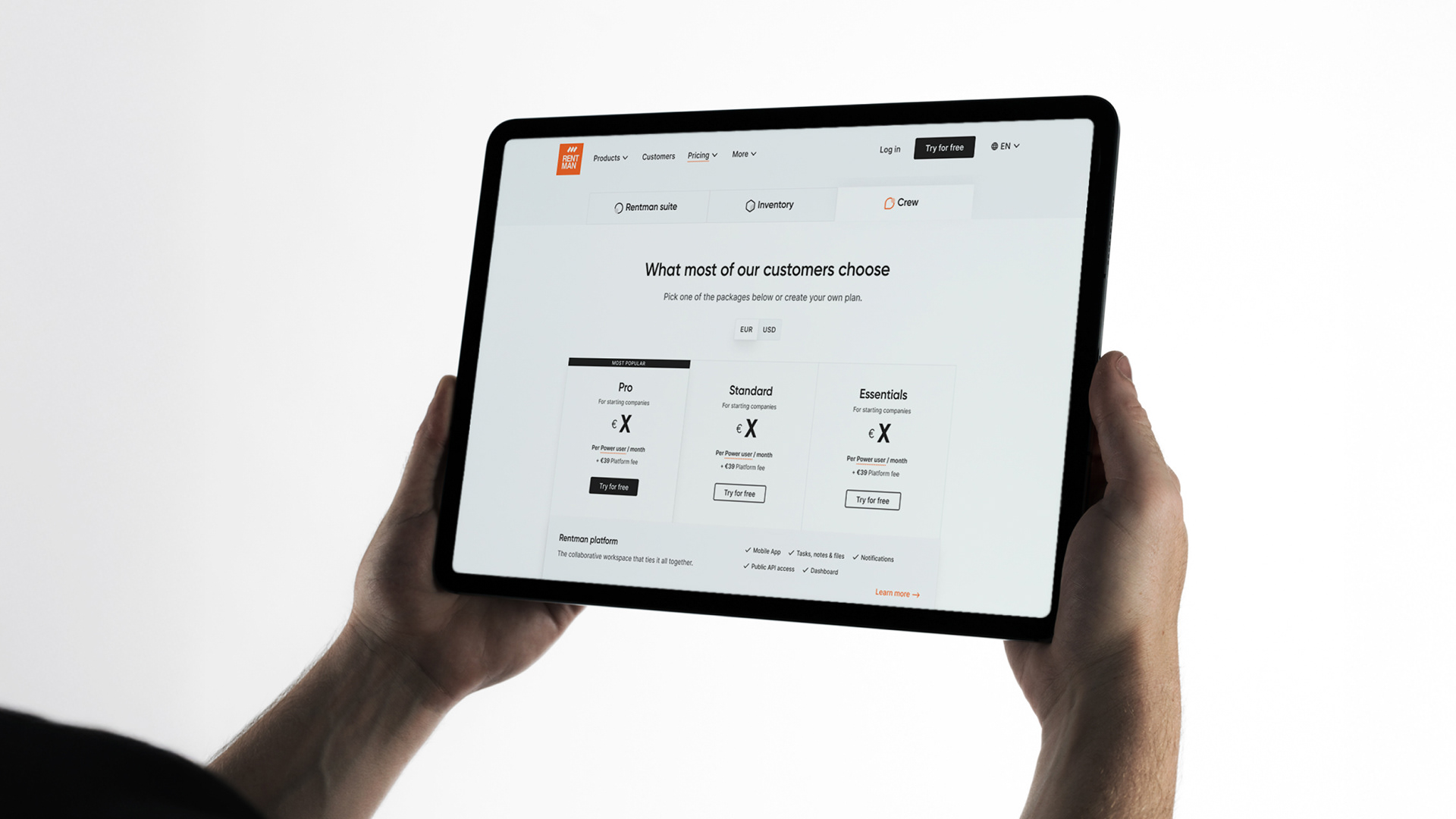
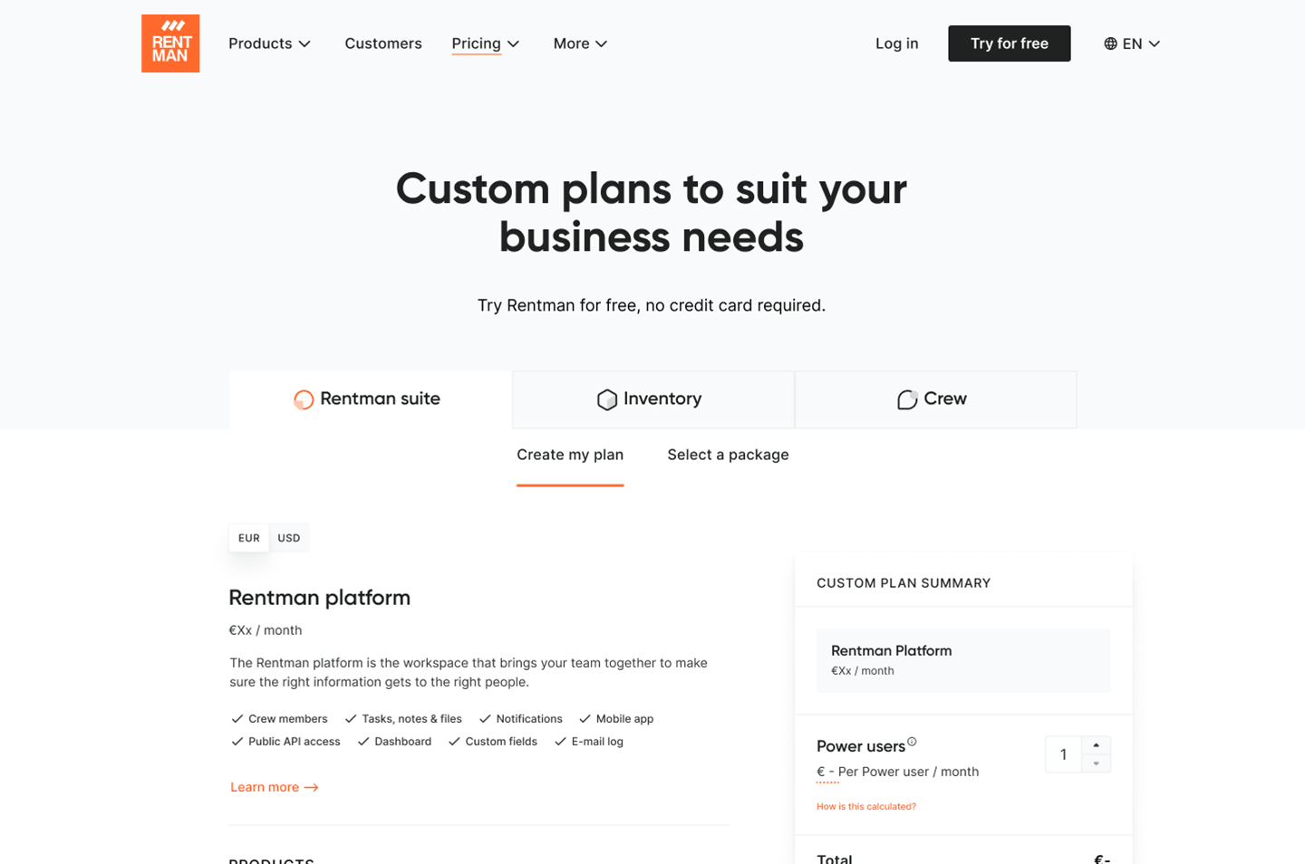
WIREFRAMES FOR THE NEW PRICING STRUCTURE
Considering the different buyer personas and use cases, the marketing manager and I brainstormed to sketch the potential architecture. After that, I started working on the design for the new pricing licenses. The first discussions turned into a low-fidelity prototype that offered the pricing structure showcased by use case and by Product. What is more, we started playing around with the chance of having an interactive path. The proposals iterated after each meeting we had.
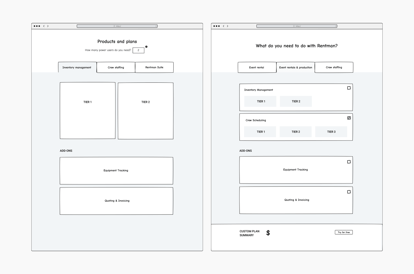
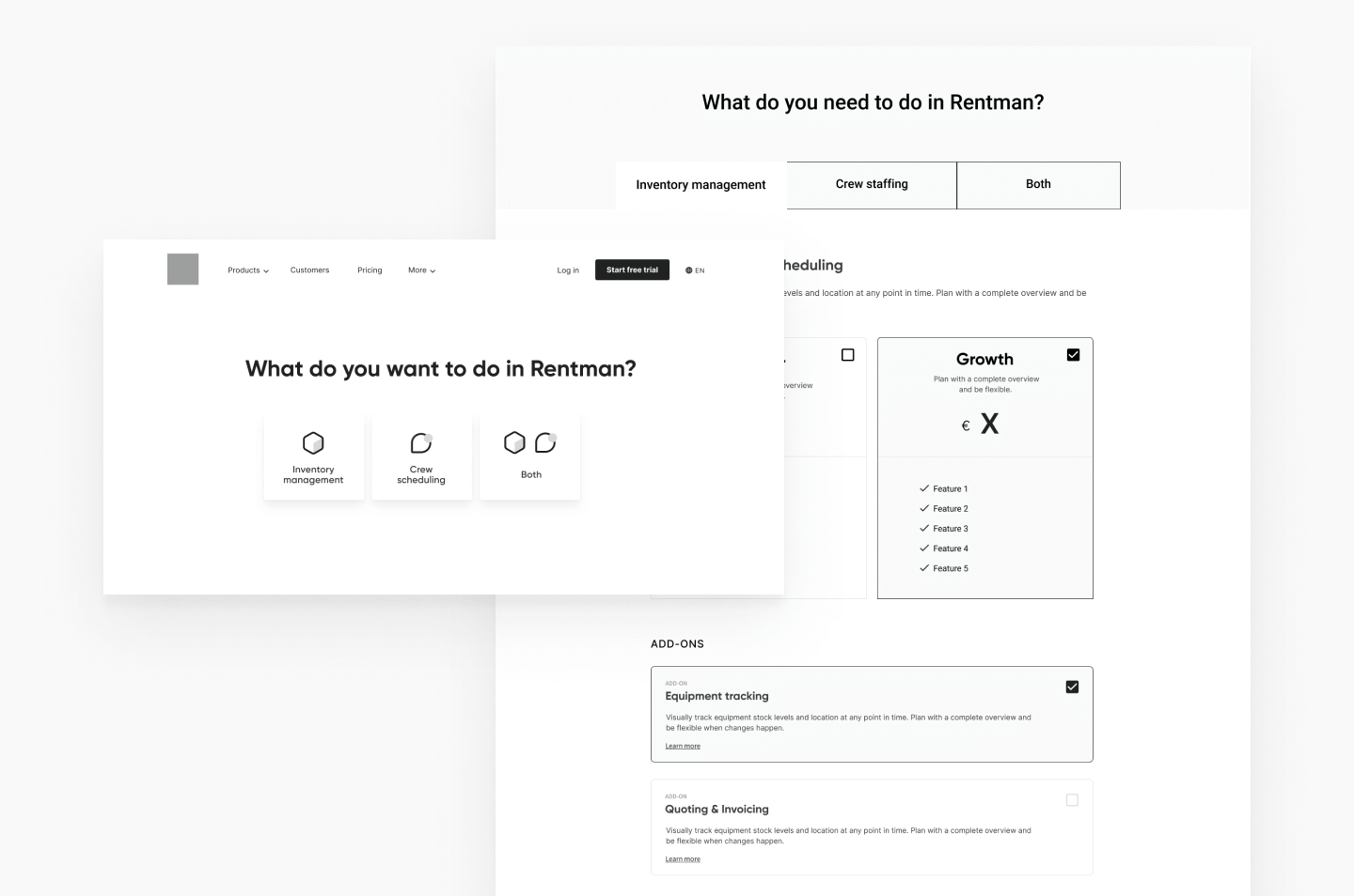
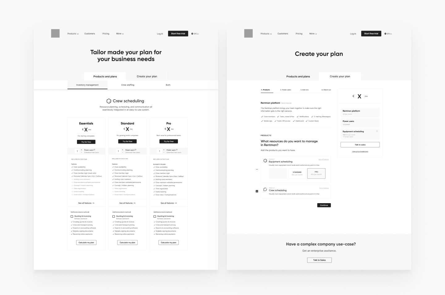

We decided to ditch the option by Use Case to avoid confusion, and we chose to give the options by Product. Also, we suggested making the users answer a question, as it was in the trial creation form, by picking the solution they need. That would later take them to the pricing tables.
With the first substantial wireframe, we had the first feedback sessions with the Sales team and Stakeholders:
— We understood that the interactive flow was crucial for the new flexible licenses. But giving so much freedom would make the users feel overwhelmed. Therefore, it would also be helpful for them to have pre-made bundles to provide a typical case for the most common uses.
— I proposed a stepper component on the Create your plan tab to avoid clutter and make them understand the steps to follow to build the plan, but it was modified.
— I proposed to make the tables with an interactive price that changes with the add-ons you select. That way, the user notices the final price without going to their Create Your Plan tab. But this option was dismissed too because of time.
— The power users (seats) had many iterations because the final decision on the pricing structure was not there yet.
Deliverables
— An iteration of the Design system & UI aligns with the brand's look & feel
— Product icon design
— Functional prototype for usability testing/feedback session
— Improvement on the Website design patterns and the navigation menu
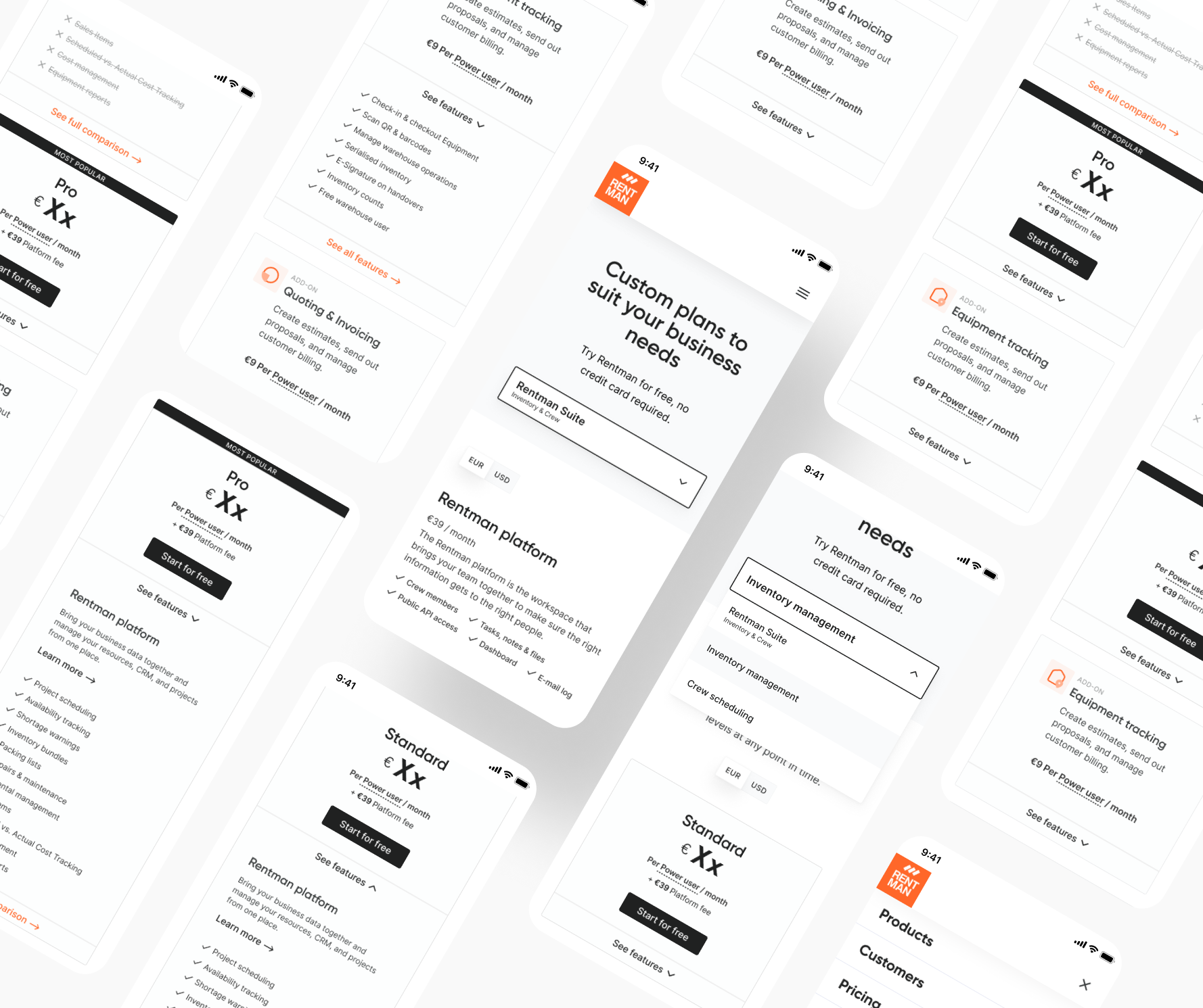
— Responsive design, and adaptation for small devices.
— Product icon design
— Functional prototype for usability testing/feedback session
— Improvement on the Website design patterns and the navigation menu
— Responsive design, and adaptation for small devices.

Testing
We ran usability testing with a functional prototype with 54 current customers. Would you be asking why there were so many?
The company decided to use this interview as an opportunity to gather qualitative insights on the new pricing structure and licences. The current customers can upgrade or downgrade their licenses. Thus, it was crucial to anticipate feedback before the official launch.
Impact and Results
The launch of the new pricing structure resulted in:
— 10% of total revenue generated from new licenses within two months.
— 31% of new licenses are upgraded from existing customers.
— Minimal customer churn (3 churns).
— Ongoing optimisation based on Hotjar recordings and heatmap analysis to address usability issues and improve conversions.
— 10% of total revenue generated from new licenses within two months.
— 31% of new licenses are upgraded from existing customers.
— Minimal customer churn (3 churns).
— Ongoing optimisation based on Hotjar recordings and heatmap analysis to address usability issues and improve conversions.


