Visual Leap: From Inconsistency to Impact
Project: Rentman Branding
Role: Brand designer | UX/UI Designer
Year: 2019—2020
Role: Brand designer | UX/UI Designer
Year: 2019—2020
Rentman provides a software solution that empowers event rental and production companies to work more efficiently. Recognising the need to adapt to evolving market demands and expand its customer base, Rentman embarked on a comprehensive initiative to revitalise its brand identity and enhance its web experience. This case study outlines the strategic design efforts that resulted in a cohesive and impactful digital presence.
Identifying the Need for Transformation
Upon joining Rentman, it became evident that the company lacked a defined brand identity, resulting in inconsistent visual communication and a generic appearance. Furthermore, with the launch of a new interface look & feel and a strategic shift to target broader market segments, there was a critical need to update the brand presence across all channels and create a more tailored web experience.
This project aimed to overcome several key challenges: establishing a compelling brand identity that resonated with Rentman's audience, developing web design patterns to enhance visual content and user experience for increased engagement and conversions, crafting targeted landing pages and content to attract new customer segments, and ultimately, demonstrating the strategic value of design to stakeholders.
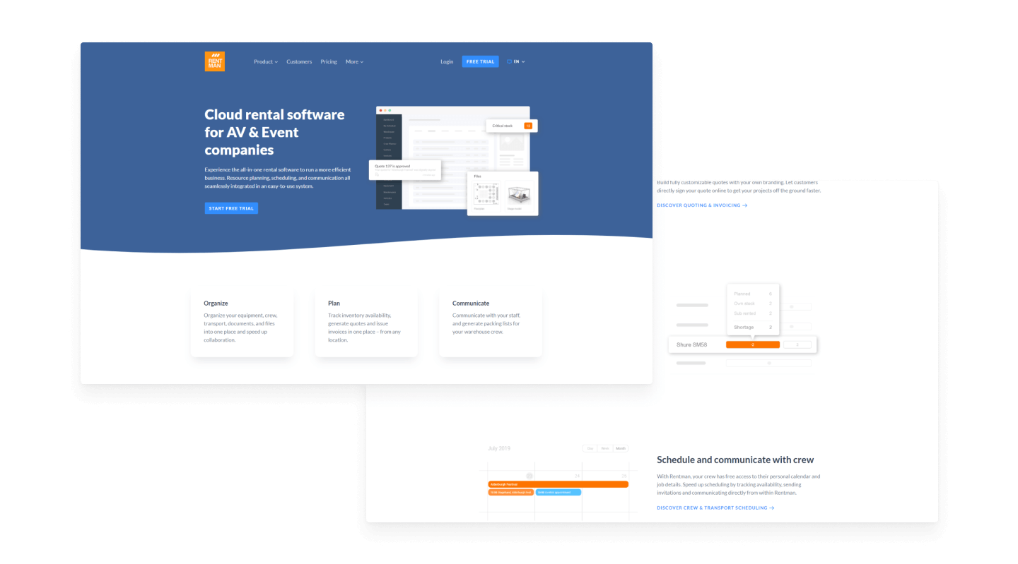
The picture above illustrates how Rentman's website before the Rebranding.
Discovery and Design Process
The design journey began with a comprehensive discovery phase. This included a thorough benchmarking to understand the landscape, collaborative sessions with the marketing team to define Rentman's core values and brand voice, and stakeholder meetings to align on project goals and potential challenges. We also worked closely with the UX/UI designer to ensure the new brand identity would harmonise with the evolving software interface.
Following the discovery phase, we moved into the design process, which was marked by iterative development and continuous feedback. Initial design proposals were refined based on insights from internal stakeholders and user research.
The first draft proposal was more aligned with the new interface look & feel but far from the Event Industry. Therefore, key strategic decisions emerged:
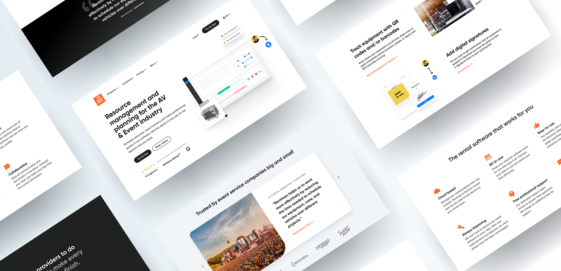
— Transitioning from a generic blue palette to a bold black and vibrant orange, reflecting the industry's aesthetic.
— Adopting a more robust icon style to enhance visual impact.
— Creating wireframe proposals to test new user flows for the web design patterns.
— Developing best practice guidelines for copywriters.
Design Solutions and Deliverables
I realised that the colour blue would make the brand identity feel still insipid, and the brand looks like any other. Furthermore, the identity was far from the mental representation of the Events & the audiovisual Production Industry. At that moment, I decided to pivot and propose a solid and bold identity, increasing the use of black because it is the colour of the industry workforce.
Design Solutions and Deliverables
BRAND IDENTITY
— A comprehensive brand style guide, including new typography (Gilroy and Inter), a refreshed colour palette (black and vibrant orange), and guidelines for imagery.
— Internal templates and resources (Confluence guidelines, business cards, Google Slides) to ensure brand consistency.
— A marketing design system in Figma, enabling non-designers to create consistent marketing materials.
— Internal templates and resources (Confluence guidelines, business cards, Google Slides) to ensure brand consistency.
— A marketing design system in Figma, enabling non-designers to create consistent marketing materials.

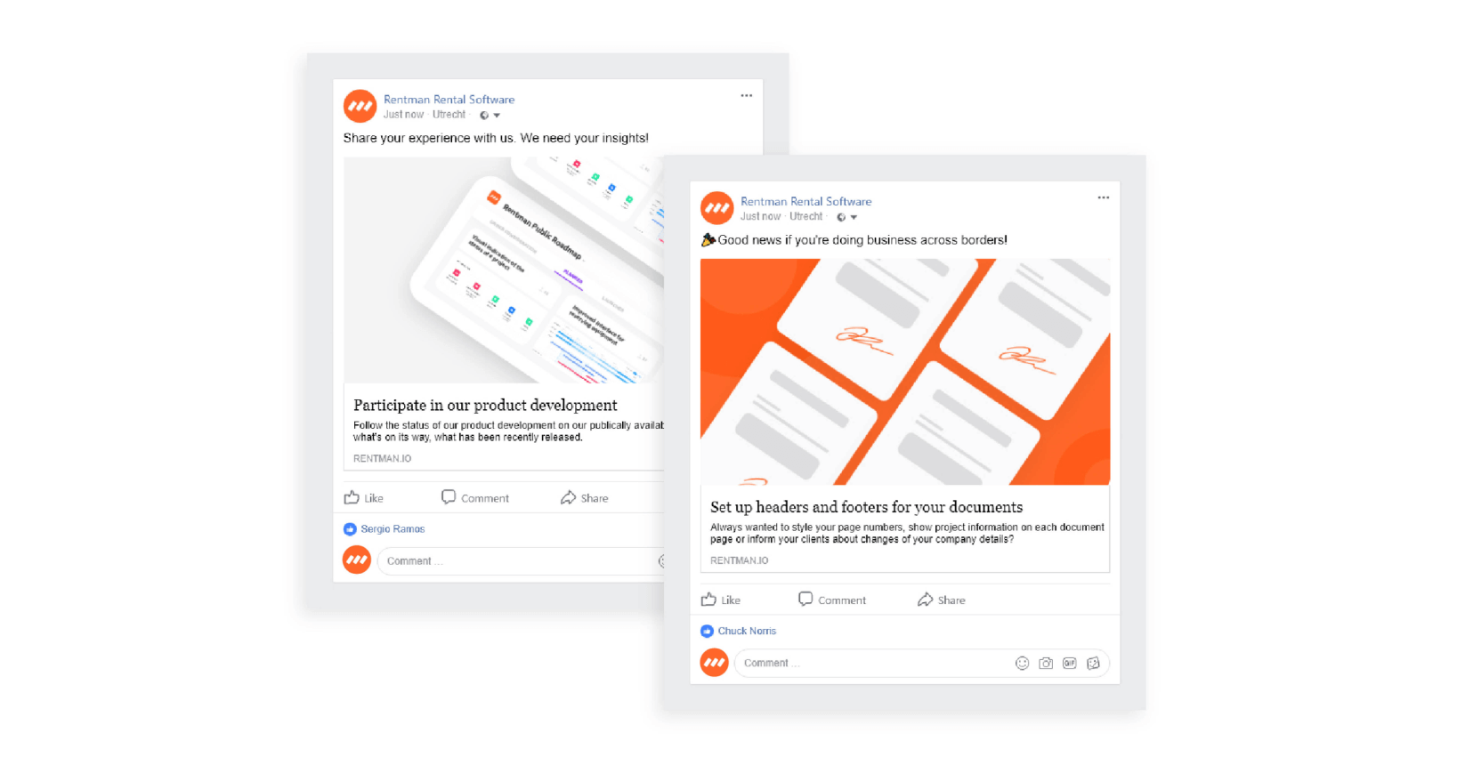

The marketing design system helped the team move forward quickly, giving the components and guidelines to create Product Updates easily or keep a consistent brand on the communication channels.
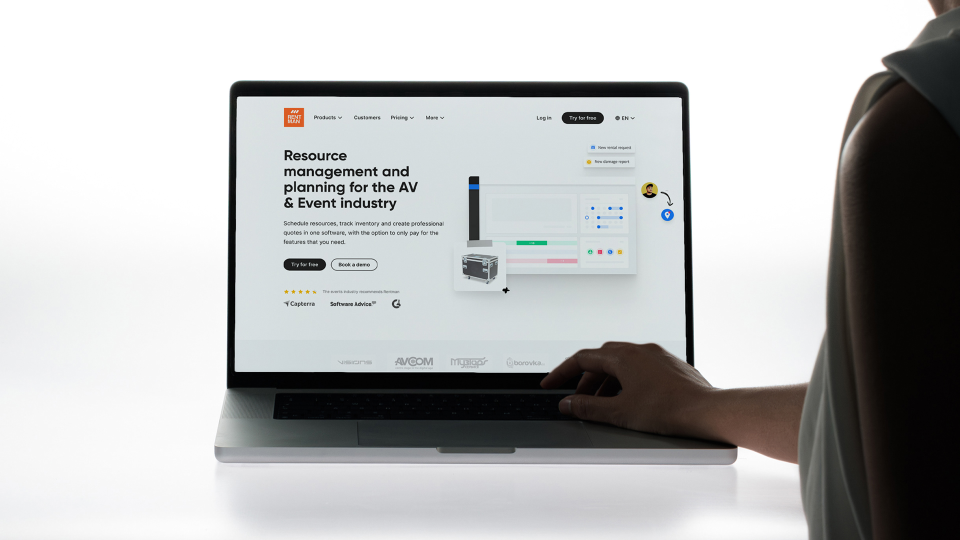
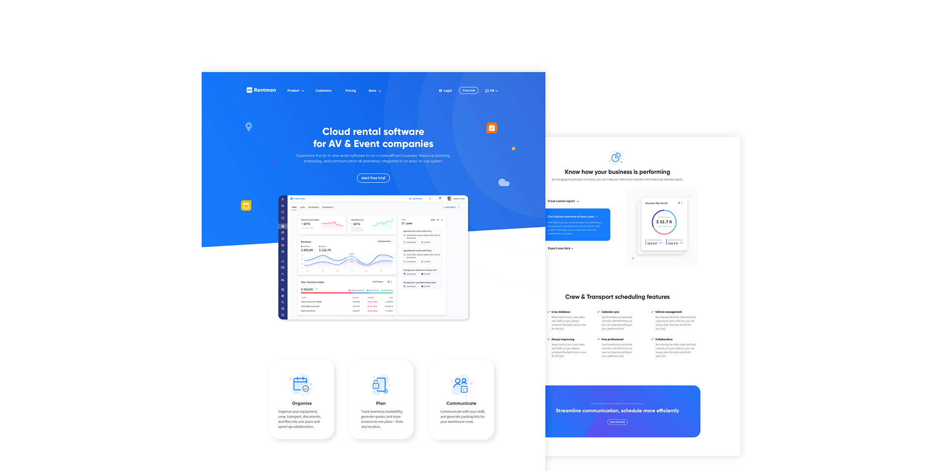
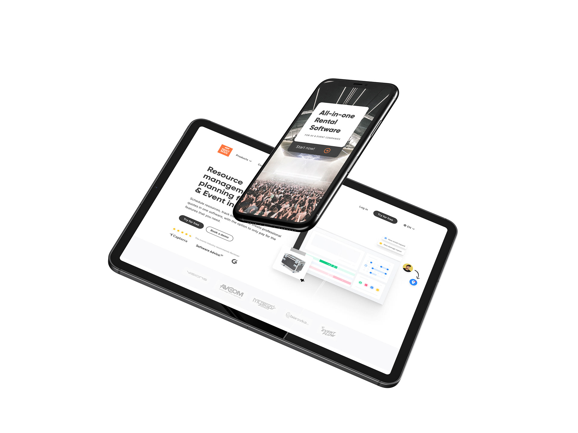
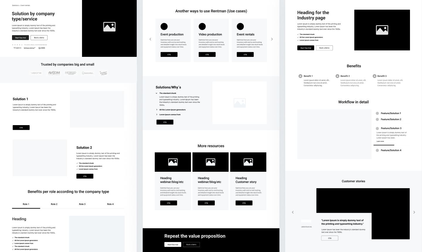
WEB DESIGN SYSTEM
— A library of curated web design patterns and page templates for landing pages, Industry pages, Blogs, and use case pages.
— New landing pages optimised for trial sign-ups and demo bookings, including a self-serve pricing page.
— Wireframe proposals and best practices guidelines for copywriting to support new user personas.
— New landing pages optimised for trial sign-ups and demo bookings, including a self-serve pricing page.
— Wireframe proposals and best practices guidelines for copywriting to support new user personas.

Impact and Results
Implementing the new Brand Identity and Web Design System had a significant positive impact on Rentman's digital presence. The refreshed brand conveyed a sense of professionalism and commitment, strengthening customer trust and fostering a more cohesive company culture. The new Web Design Patterns and landing pages enhanced the user experience, streamlining the customer journey and increasing conversion rates. This project not only demonstrated the value of strategic design but also highlighted the importance of iterative development and stakeholder collaboration.
This project was a valuable learning experience, particularly in leading a comprehensive branding and web design initiative in a new cultural context. The emphasis on early iterations and rapid prototyping proved crucial in achieving a successful outcome.


